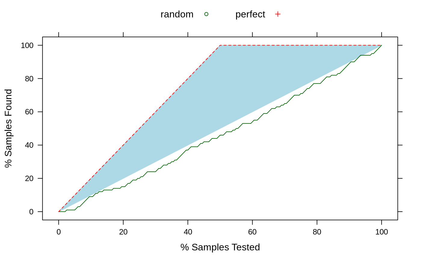
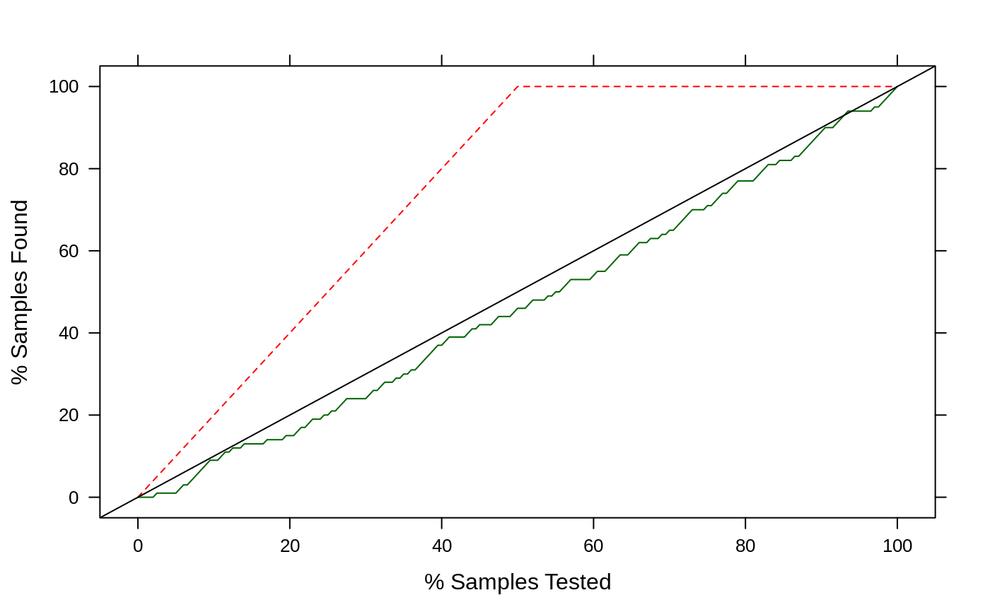
Two panel functions that be used in conjunction with lift.
panel.lift2(x, y, pct = 0, values = NULL, ...)
Arguments
| x | the percentage of searched to be plotted in the scatterplot |
|---|---|
| y | the percentage of events found to be plotted in the scatterplot |
| pct | the baseline percentage of true events in the data |
| values | A vector of numbers between 0 and 100 specifying reference
values for the percentage of samples found (i.e. the y-axis). Corresponding
points on the x-axis are found via interpolation and line segments are shown
to indicate how many samples must be tested before these percentages are
found. The lines use either the |
| ... | options to pass to
|
Details
panel.lift plots the data with a simple (black) 45 degree reference
line.
panel.lift2 is the default for lift and plots the data
points with a shaded region encompassing the space between to the random
model and perfect model trajectories. The color of the region is determined
by the lattice reference.line information (see example below).
See also
Examples
set.seed(1) simulated <- data.frame(obs = factor(rep(letters[1:2], each = 100)), perfect = sort(runif(200), decreasing = TRUE), random = runif(200)) regionInfo <- trellis.par.get("reference.line") regionInfo$col <- "lightblue" trellis.par.set("reference.line", regionInfo) lift2 <- lift(obs ~ random + perfect, data = simulated) lift2#> #> Call: #> lift.formula(x = obs ~ random + perfect, data = simulated) #> #> Models: random, perfect #> Event: a (50%)## use a different panel function xyplot(lift2, panel = panel.lift)

